Brand Identity and Visual Design You Can Actually Apply
A logo, a colour system, and a type hierarchy that hold together across a website, a deck, and a shopfront. Delivered with guidelines your team can apply without calling us.
Overview
What is Brand Identity and Visual Design?
Brand identity design is the process of creating the visible and verbal system a business is recognised by, including its logo, colour palette, typography, imagery, and tone of voice. Visual design applies that system consistently everywhere customers meet the brand.
Identity work starts with positioning, because a mark only means something next to a promise. From there the visible system gets built: a primary logo with the variants real life demands, a colour palette checked for contrast and for print, a type hierarchy with clear rules, and the photography or illustration direction that sits alongside them. Everything is delivered as usable assets in the formats each channel needs, with guidelines written for the people who will use them daily rather than for a design award.
Capabilities and features
A Mark That Survives Real Use
The logo is designed for the sizes and surfaces it will actually appear on: a favicon, an app icon, an embroidered shirt, a dark background. Colour is chosen for accessible contrast and checked in print, not only on a calibrated screen.
- Primary, stacked, and icon logo variants in vector formats
- Palette with accessible contrast pairs and print references
- Clear space, minimum sizes, and misuse rules documented
Rules That Make the Next Thing Easy
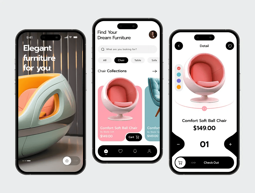
A type hierarchy with defined sizes and weights, plus the supporting language of grids, imagery, iconography, and motion. Licensing is checked, so the fonts you are shown are fonts you can legally use on the web and in print.
- Type hierarchy with licensed web and desktop fonts
- Grid, spacing, and iconography rules built for reuse
- Photography or illustration direction with real examples
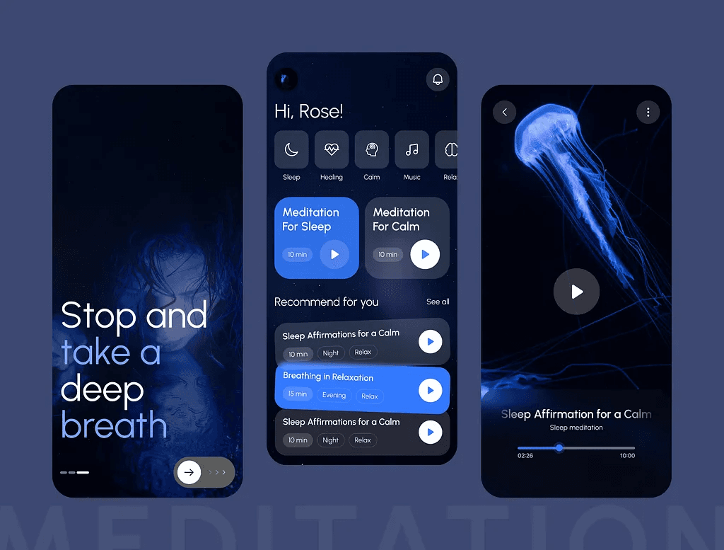
Handed Over as Templates, Not a PDF to Admire
Guidelines are written for daily use, and the templates that get used most are already built: slide decks, social sizes, email signatures, letterheads, and web components matched to the identity.
- Brand guidelines covering logo, colour, type, and tone
- Editable templates for decks, social, and documents
- Asset pack organised by channel and file format
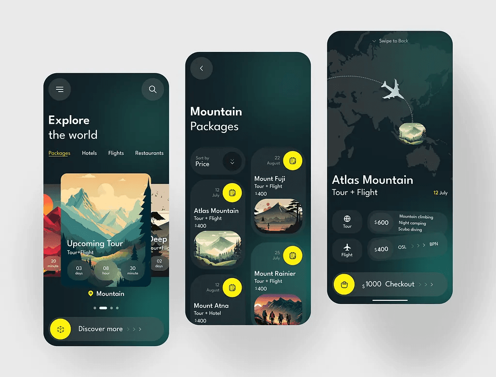
The real impact
Why it matters
Inconsistency reads as inexperience. When the deck, the website, and the invoice look like three different companies, buyers notice before they can say why. A documented system removes that, and removes the argument about it every time something new gets made.
Increase in brand recognition. Using a consistent colour palette across all brand touchpoints can boost recognition by up to 80%. Colour is one of the most underestimated tools in brand design.
Source: DemandSage, 2026
Say consistency adds 10-20% to revenue. More than two-thirds of companies report that brand consistency directly contributes to revenue growth of 10 to 20%.
Source: Dash, 2026
Higher lifetime value from emotional connection. Customers who feel emotionally connected to a brand have more than three times the lifetime value of those who do not.
Source: The Visual Communication Guy, 2026
Technologies we build with
 Figma
Figma Adobe Illustrator
 Adobe Photoshop
 CanvaFigmaAdobe IllustratorAdobe PhotoshopCanva
Explore more
Related services
More ways we help teams with design.
FAQ
Frequently asked questions
Everything you need to know about this service.
Positioning and tone, a logo with its variants, a colour palette, a type hierarchy, imagery direction, and written guidelines. Delivery includes vector and raster assets in the formats each channel needs, plus editable templates for the things you produce most often.
Ready to start your next project?
Let us turn your idea into software that scales. Book a free consultation and we will map out the build with you.
Trusted by the teams we build with