UI and UX Design That Needs No Explaining
Research, wireframes, and interface design for products people can use without a manual. You get a clickable prototype to test and a design system your developers can build from.
Overview
What is UI/UX Design?
UI design is the visual and interactive layer of a product, covering layout, colour, type, and states. UX design is the research and structure behind it: who the users are, what they are trying to do, and the shortest path to it. Most products need both, in that order.
Design work starts with evidence: what people currently do, where they give up, and what the analytics and support tickets already say. From there, structure comes before decoration. Wireframes settle navigation and hierarchy, a clickable prototype is tested with real users, and only then are colour, type, and motion applied. What you receive is not a folder of screens. It is a design system with components, states, spacing, and tokens, documented for handoff so what gets built matches what was approved.
Capabilities and features
Evidence First, Opinions Second
Existing analytics, session recordings, and support tickets are read before anything is drawn, and the gaps are filled with short interviews or usability tests. The output is a ranked list of problems with the evidence attached, so design decisions stop being a matter of taste.
- Heuristic audit of the current product with severity ranking
- User interviews and usability tests built around real tasks
- Findings tied to analytics rather than assumptions
Test the Structure While It Is Still Cheap
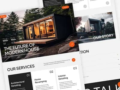
Low fidelity wireframes settle navigation, hierarchy, and flow before visual design begins. The prototype is clickable and tested with people outside the project, which catches the problems that only appear when somebody has a task to finish.
- Information architecture and user flows agreed up front
- Clickable prototype in Figma for desktop and mobile
- Usability testing with tasks, not a demo walkthrough
A Design System, Not a Pile of Screens
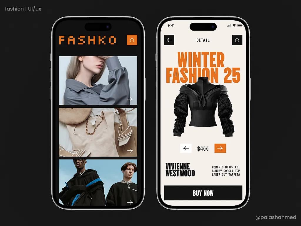
Components, states, spacing, type scale, and colour tokens are documented, so the build matches the design and the next feature does not reopen settled decisions. Handoff includes a walkthrough with the developers who will implement it.
- Component library with states, tokens, and spacing rules
- Accessible colour contrast and focus states specified
- Developer walkthrough and written documentation at handoff
The real impact
Why it matters
Confusing design rarely produces complaints. It produces silence: unfinished signups, abandoned forms, and support tickets that repeat. All of that is measurable, and fixing structure before launch costs a fraction of fixing it after.
Every dollar invested in UX returns $100 in business value (9,900% ROI). This is one of the highest-returning investments a product team can make.
Source: Forrester Research
Of online users will not return to a site after a bad experience. You get one chance to make the product feel right.
Source: Amazon Web Services / Maze, 2025
Increase in conversion rates from good UX design. Good UI alone can lift conversions by 200%. Combined, UX and UI are the highest-leverage tools for growth.
Source: Forrester Research
Technologies we build with
 Figma
Figma Adobe Illustrator
 Adobe Photoshop
 CanvaFigmaAdobe IllustratorAdobe PhotoshopCanva
Explore more
Related services
More ways we help teams with design.
FAQ
Frequently asked questions
Everything you need to know about this service.
UX is the structure and the reasoning: who the user is, what they are trying to do, and how the product gets them there. UI is the surface that carries it: layout, colour, type, states, and motion. A beautiful interface over a bad structure still fails.
Ready to start your next project?
Let us turn your idea into software that scales. Book a free consultation and we will map out the build with you.
Trusted by the teams we build with